Monday, May 10, 2010

Building a Birdman

Going Gizawatt
[Scroll to bottom if you don't wanna read/see an animated .gif !]
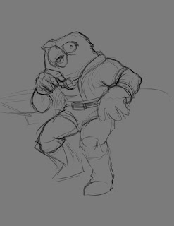
Here's a process post about the making of this Thadius Gizawatt, galaxy renowned space explorer from Mark Rudolph's "Mulligan's Run". Mark does a microcast "Mark of the Beast" as part of the Art & Story Supreme content and posed some questions about the process. It did so happen that I saved some images while working on this piece, so here's how it all went down! :

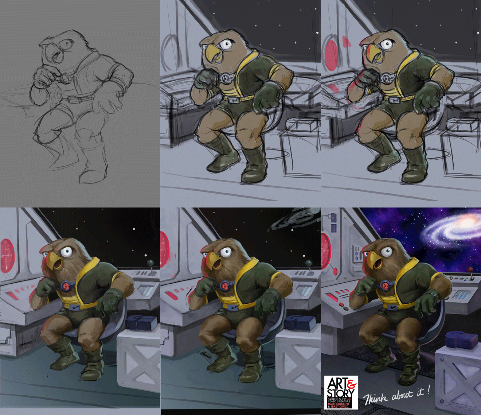
I usually start with a pencil sketch that I scan in-- but I went rogue this time. An idea for the painting was in my head pretty early on, so I worked out the pose straight into the computer using my Intuos tablet. No special brushes at this point, just good ole Round, with pressure sensitivity turned on.
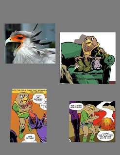
I realized I needed better reference for Mr. Gizawatt to familiarize myself his costume, proportions, and see which parts of him are anthropomorphized. I would later use the bird photo reference to put in subtle feather textures on him.
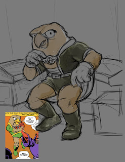
I kept this nice image of him being choked (I know, how cruel) as I laid out some of his environment. I pictured him as being a reflective kind of guy and wanted him to rest his chin on his fist, but hadn't figured out where his elbow would go at this point.

The spaceship consoles were actually desiged around him to fit as I added in more background. Once I knew just about where things would go, I separated him onto another layer and began to define his silhouette. My favorite brush for this part was from a Chris Oatley's set of custom ones: "Soft Oil Tapered 88" and a modified Calligraphy Oval set to Pressure sensitive.
For the most part, I paint at about 70-90% opacity.

Here I started to add a strong light source. I wanted something bright and saturated so went with a red glow from a radar screen or something. I wanted to keep with a very colorful palette and also a compliment to his green suit.
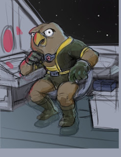
I shrank his feet [thanks Transfom tool!] to better match his small stature. I also cut out the metal box onto another layer so I could compose it as a foreground element later.
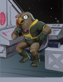
At this point, you start to see more form being described as I darkened the figure using Multiply in my Brush options. Using the same or slighter lighter color in multiply seems to keep it from getting too muddy. I try to sample color [alt/option] while using the brush tool to stay within a decided color palette and use HSB sliders in my Color selection window so I can see both value and saturation.

The paint challenges at this stage feel like a mix between Acrylic and Watercolor so I treat a bit like Gouache. I used less opacity for laying down darks and higher opacity for lights (Something I read from Paul Lasaine's blog-- an exceedingly amazing Dreamworks artist who's very generous in sharing his knowledge and methods)
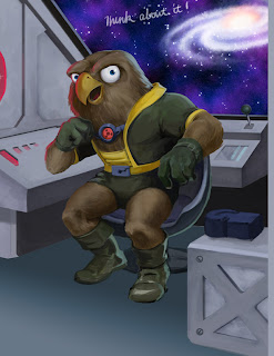
A lot of the background was very angular and geometric so I used a lot of Shift-click and turned off Pressure sensitivity to draw in the spaceship interior. Once the forms were in there, I used Magic Wand to select planes of shapes and added in some 'painterly' strokes to give it a bit more lived-in look. I used the Burn/Dodge tool to do the same and punch it up. The floor was a photo texture Transformed with Perspective/Skew to fit.

The Nebula was added in to give it the second rim light source (putting multiple light sources throws a form in the round real quick). He's actually lit by three (the third one at his feet shining his boots...maybe coming from somewhere behind the box) just to stage it bit more 'theatrically'.

I could have taken the easy route and just found a pic from NASA.com, but decided to draw the the spacescape from scratch. Here's a how to build your own universe:


Galaxy Quest
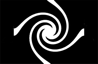
Draw a simple starburst pattern from the center using the Polygonal Lasso tool, then
[Filter > Distort > Twirl]
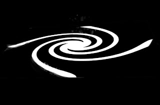
[Edit > Free Transform] to manipulate it into the right perspective.
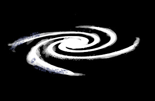
Start to add some brush texture. I used a combination of Spatter Brush and a custom Oatley's "Feathers" Brush while adjusting Scatter in the Brush Presets. The custom brush creates that speckle pattern if you don't drag the stylus, just dab like a real-life sponge and let Size Jitter from the Presets do the work for you.
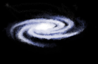
It kind of jumps here... I must've got too excited about creating new life and forgot to save a step (it happens ie: Cambrian Explosion~). I selected a bluish/purple hue with a slighted cool white and alternated between them painting the spiral arms. I tried to finish with the lighter stars opaque on top. For the galactic core, I used the brightest white.

The interior core was a white with an orange [Outer Glow] set in [Layer Styles]. I played around by duplicating and using a combination of Blending Modes.
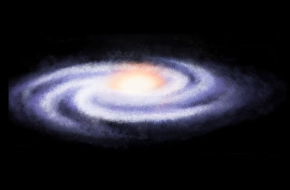
To create just a few billion (well technically...) more wayward stars, I duplicated on another layer, set the blending mode to Screen, reduced Opacity, and scaled it it to haze out the edges.


Eat your Heart out Hubble

That lonely black needed some colorful nebulae (nebulas? nebuali~?), so here's how that came about:

There's tons of ways to draw a star field I'm sure, but I used the Photoshop trick of [Filter > Noise > Add Noise]. Check Monochromatic, play with the sliders, and watch a black canvas turn into deep space. I selected a swatch of the dots, duplicated, and Transformed them larger to make bigger stars-- Screen Blending in Layers to see all of them.

On two Layers, bottom one black and second one a saturated color, select top color and [Filter > Render > Clouds] and repeat the filter until you get some clouds you fancy. I took a piece and blew it up to the size I liked.

Repeat the process using another color. You can see where I Lasso'd the shape of the other one. While selected, going to [Select > Feather> ~15 pixels or so] softens the shape nicely. Use Blending Mode Screen to see them both.
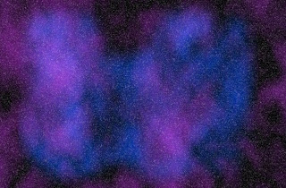
Combine that earlier star field with on a Screen layer to get something like this. Use these two layers to move/rotate/scale them around till you get something like the startup screen on a Mac.
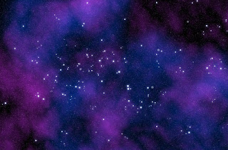
Voila--!
I drew in the larger stars with a standard Round Brush and duplicated to add some variety. As an afterthought, I kind of wish I had spelled out something clever in the constellations.. o well, you can do that.

Choosy Moms Choose GIF

(It's the poor man's process vid !)
Wednesday, May 05, 2010

Soviet Scribbles and Sin City Sketches


Soviet Scribbles

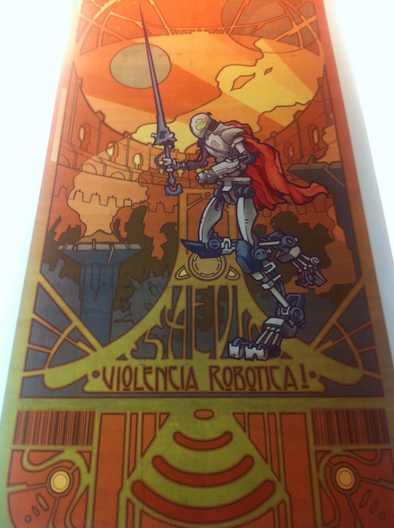
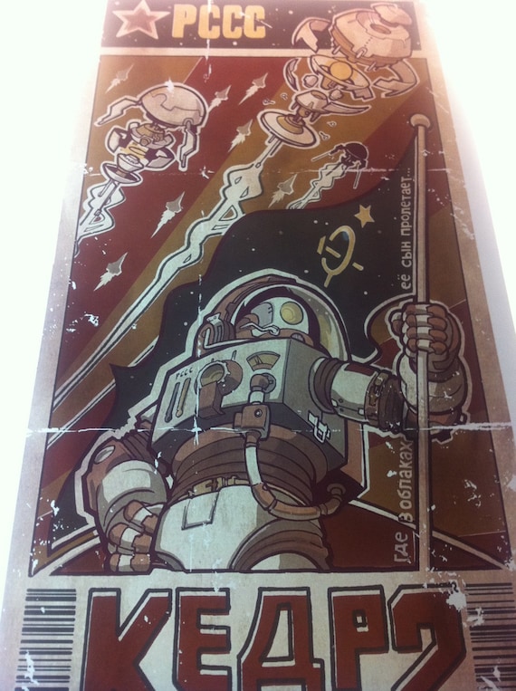
I found this book at a Barnes & Noble, "Red Star over Russia". Skimming through the pages to find poster reference for a new "Nouveau Robotica" piece, I ended up reading a lot of it-- turned into a mini history lesson...
Also coincidentally timed in my Netflix queue's arrival was a movie called "Russian Ark" by director Alexander Sokurov. It's an epic tour of the Hermitage Museum in St. Petersburg presented in a grand theatrical scale with over 2000 costumed actors. Elaborate portrayal both visually and metaphorically of the country's history and identity with European culture--presented all in one take. Quite a feat with very unique effect in a full length feature.


Sin City Sketches

If you can't afford a plane ticket to Europe, here's an option for you! The Romans copied the Greeks, and so Las Vegans copied the Romans (and Paris and Venice and Egypt and Rio and..) with varying levels of hokeyness. Keep off the beer goggles and look hard enough and you can find some pretty decent copies~

In the sketches: a view from from our hotel of 'Paris', 'The David' at Ceasar's Palace, and a juggler at 'The Venetian'.
Cool performer costumes in the indoor mall made to look like St. Mark's Square in Venzia... much less pigeons here.

I also drew one of the human statue guys. Really cool drapery, and the stillest model you could ask for. We need more of these guys in our cities...
Too bad the photo's blurry, but I gave him the sketch-- got a wink in return.

Sunday, April 18, 2010

We Have a Winner!


The Zaku MS-06S

So posted above is the finished prize for David Torres , one of the winners of the mini-sweepstakes I ran at Wonder Con in San Fransisco couple weeks ago. I hope the awesome people who bought a poster checked the number on the wax sealed paper band because--

There is one more winner floating around out there! (probably somewhere around Northern Californa..)

The winner opted for the custom color robot sketch (which turned out more like a finished watercolor piece~) from the Gundam Wing series. I admittedly had to bone up a bit on their design since it's been while since seeing any of the series. A lobster+ stormtrooper+ cyclops+ spikey Mario Bros turtle + badass gun!

Hope he likes the result-- The original's in the mail!

The texture in the watercolor for this piece was made using table salt--which happened to be at...

Drink & Draw Social Club

This is a really cool group I recently discovered that gets together in downtown L.A. every Thursday night at Casey's Irish Pub. I ran into an old co-worker the first time I stumbled in--fun times and actually getting some drawing done at the same time! A real inviting and inspiring bunch of creatives gather here every week. Shout outs all around to local pals who want to join in!

Here's a sketch on recycled toned paper I did there--

Thursday, April 01, 2010

Nouveau Robotica 'sweepstakes'

01CKT-65B-4919


Did you find this code on a poster? Thanks for stopping by at WonderCon Booth #AA070 !

Your prize, should you choose to accept it...
e-mail me and I'll send you:

1) your choice of any of the other Nouveau Robotica posters.
OR
2) a custom original color sketch of a robot character (just trying to stay within a theme ;])
An original character, or Robocop, or a Cylon, a Terminator, Al Gore, you name it!

If this doesn't make any sense...

that's understandable! The picture above is the wax seal I used to wrap the "Nouveau Robotica" series of mini-posters I am/was selling at WonderCon (April 2-4). Each of these had a code and a lucky few were marked with the alpha-numeric above.
I'll post the result when finished with the winner's approval~
I'm also in the process of setting up an online store for these posters and hopefully other works as well. Stay tuned on here, Twitter, or the newly created Facebook page !

(winner: Please allow at least 2 weeks for delivery! Cheers for checking out the blog to all ya'll)

Monday, March 29, 2010

Monkey Mod Punch!

Monkeying around

(I was pretty surprised while typing this... "monkeying" passes spellcheck! People must engage in this verb a lot... )

This is fan art for Kevin Cross' slick comic, Monkey Mod-- the mod rockstar simian superhero!
He's got a cool animated trailer to go along with the webcomic too. (Aw "webcomic" does not pass spellcheck :[ ) I checked out the preview mini comic "Monkey Mod Unmasked" and really dug the production value (screenprinted cover/ hand stiched) put into it. It's raised the bar to do the same for what I'm working on too... aiming to have it ready for WonderCon.

Better than Pizza!

I feel it my duty to make some noise about the newly minted Art and Story SUPREME here too. The premium content counterpart to possibly the most helpful and inspirational cartooning podcast out there. The content I've seen and heard is really worth it-- especially the process videos. Kevin's microcast is called "High Adventure Daily" and it does deliver. I feel like punching barbarians to punk rock after every listen...

Wednesday, March 24, 2010

Wienerschnitzel and Wondercon


Wienerschnitzel promo for Adville USA

This is a promotion going on right now for Wienerschnitzel's corndogs at Wienercash.com
Not sure if the corn dog rapper's name is mentioned on the site, but his moniker's been dubbed "C-Dogg" :]
You can enter into the sweepstakes by entering the code on the sticks of them tasty snacks and have a chance to win $10,000!

I did the character and environment designs as well as take a leap into a less familiar challenge: Animation--! I hope a lot of people enter the sweepstakes because you only get to see the first segment of the animation before entering the code and it takes you to the Eating Machine (which took time to design :P)

The project sure built an appreciation for the craft of animation and nudged the possibility of applying it to some of my personal projects. I've seen some limited animation techniques like Jim Luhan's one-man "ghettomation" shorts that show it's totally possible even with limited time and resources.
There was a bit of research that had to be done with my very limited knowledge of rap and hip hop... I ended up taking some queues from Justin Timberlake's skit on SNL and a segment of from the Cleavland Show... fun stuff!

The character went through quite a few iterations-- above are some of them that turned into the e-bytes versions. I liked the Kanye glasses, but I think it took away some expressive qualities...
Among the different challenges, I learned quite a bit from looking at Chris Oatley's work samples that had characters making different phoneme mouth movements for lip-synching and making silly faces on my isight camera...
Check out my storyboard specific blog post to see the full development boards for the animation. Oftentimes my storyboards get turned into animatics, so it serves well to add it to a skillset and add some extra panache~

Wandering to Wondercon

I'll be at this convention in San Francisco at booth AA070 with my friends at Ralphco Comics (Ralph Miranda, Jeremy Parsons, Stephen Yan). I had a fun and positive experience at APE last year and hope I get to meet more fellow creators and enthusiasts. I'm looking forward to checking out this con for the first time, plus the city's a fantastic backdrop for the event.

I'll have prints of the Nouveau Robotica series, buttons, and some other goodies to share-- stop by if you're in town!

Saturday, March 13, 2010

Faces and Creatures


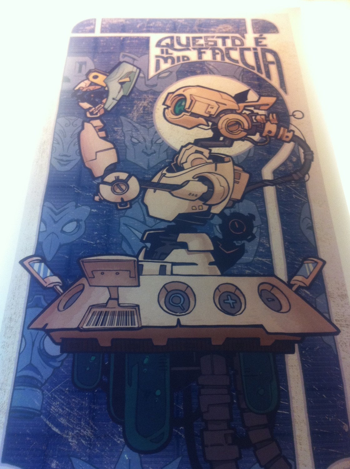
Questo e il mio Faccia // "This is My Face" (EDIT: bad Italian grammar)

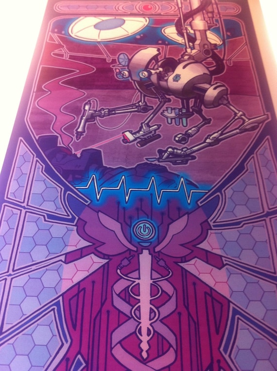
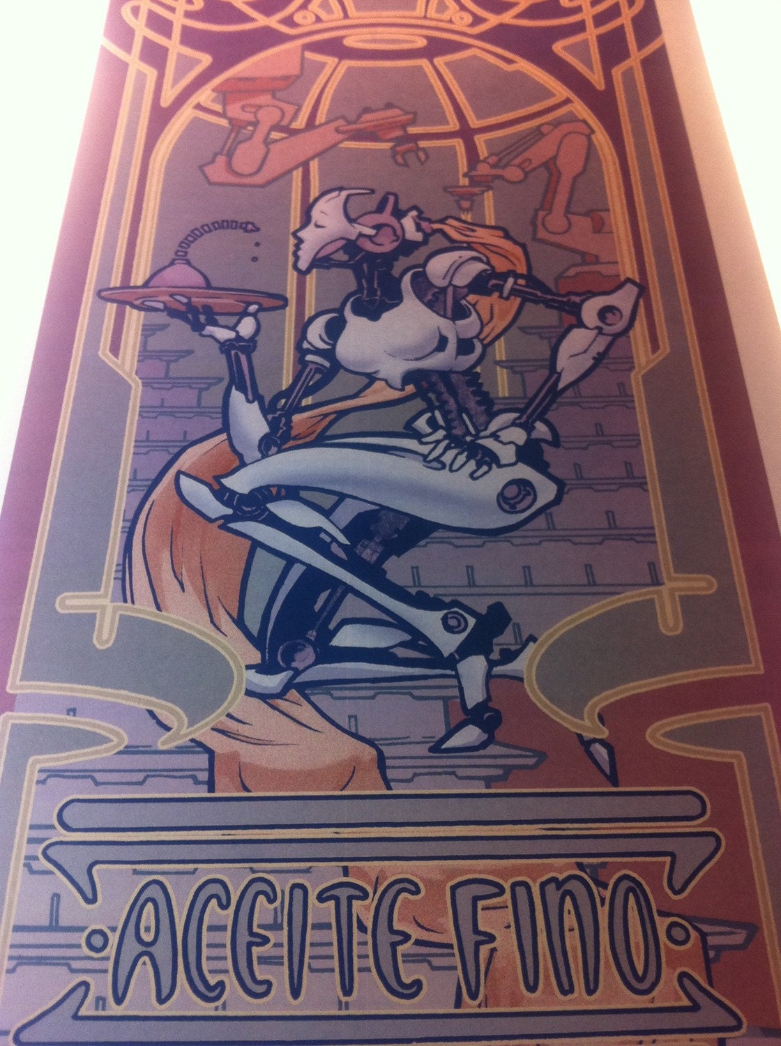
Model 006 [Italian import] in the Nouveau Robotica series. An homage to the "Absinthe Robette" poster by Henri-Privat Livemont-- my robotic interpretation of how we put on our 'faces' on ole Facebook.

[Bonus points and an original ink sketch for anyone that knows where I got the title!]

I may try to elaborate more on the symbolism I've attempted to incorporate into this one and the series as a whole, but I'd love to hear other theories and opinions as well.
I scribbled in a sheet of sketches to stick to making a series and have since planned on making enough robots for a calendar, so 12 all together. Half way there~!


"Heavenly Creatures"

This is a show that's going on tonight at Pehrspace in Echo Park with artist Karin Jancuk. Yes, very last minute-- as in right after I click 'Publish Post', I'm delivering my piece to the curator. Indeed a good thing she's a friend. I have a piece that's acrylic paint on acrylic sheeting-- a style and medium that's a departure from my usual, but a fun exploration with a Rilo Kiley inspired title.
If you're on Facebook, put on your best face, add, and check out the invite here !

Thursday, March 04, 2010

'Daily' Sketches and Demo

"Daily" sketches:


I purposely left those quote marks as a sort of disclaimer that I'll do my best to keep up! These inks are a means to practice using some good ole analog tools, namely brushes, nibs, and pens. A great way to warm up the hand before doing more heady illustration, I've taken a cue from the talented GoGoIllustration sketch blog. They sure seem to be upping the ante as a group-- their work getting more polished with backgrounds/color!

In trying to keep these pretty casual and to stay interested, I wanted to pull inspiration from the things I liked most as a kid-- the stuff that reminds you why you wanted to draw all day in the first place... So I decided to start with characters that I've dressed up as during Halloween and other events in my childhood and some *ahem* more recently. Except for Yoda, I've donned some home made fabrication of these characters at one time or another. Maybe on my 900th birthday, I'll give the good old Yoda ears a whirl...

I think I'd like to keep the 'Dalies' in a separate sphere from this blog for now, but if you'd like to see them so far, check out the Flickr photo set. I update when I post a new one on the Twitter as well.

My buddy Ralph who I worked with on the drawing female space cadets has also been inspired enough to start his own blog with daily ink sketches as well (he's been more dedicated, no quotes around the 'daily' in his title or practice~) See his inks here: www.ralphious.blogspot.com


'Creatives Gone Wild' during Arty Gras:

This Saturday I'll be doing a watercolor demonstration for Grumbacher watercolors at a local art store. There's a ton of activities to choose from during Art Supply Warehouse's annual Arty Gras Sale (3/5 - 3/7) in sunny Orange County (err..rain or shine). Check out their schedule of demos and 'make-and-take's on their Facebook page. It's 25% off pretty much everything in the store so if you're in need of any art materials, now is the time to load up :] Learn about some new techniques and tools out there too!

There's also a show opening featuring the local talent from ASW in a gallery in the same plaza. I'll have a piece in there as well which relates to the comic anthology story I mentioned a couple posts ago. It's the first time in a long while to do some 'real' painting so I was glad to have the opportunity. The gallery event has a very fun theme: "Sideshow"-- which interestingly enough, it certainly is, next to the big sale events.

I hope they have a clown.. preferably robot.

Friday, February 19, 2010

Digital Painting Process: "Opal"

Opalescent Descent:


I've been watching a lot of time lapse videos of the art making process lately. It's been really interesting to see people's processes. I haven't actually looked into how to record one of those myself, but I do make it habit to save frequently and so we have this here--!

This a short process post about making this digital painting of a character called Opal in the comic "The Front" by Jerzy Drozd.
The author is of course is one of the hosts on "Art & Story", a podcast that explores the deep ideas within the craft of cartooning. I originally read the comic to better understand the references made in the show about considerations for character development, panel layout, dialogue, themes, pacing... it goes on. Like mentioned, the podcast digs really deep!

As most of the comics I've been reading lately have been more for grown-ups, the book was a surprisingly entertaining read as all-ages content. It hammered a good point: "All-ages" doesn't mean "For kids only"! Solid storytelling with compelling characters and a lot fun, find it on Indy Planet here.

The podcast is also on my most-recommended list not just for cartoonists, not just writers-- but any folks out there with some curious spark in them. A musician friend of mine and I have can rap and relate about some of the creative topics covered.

Further thanks goes out to another podcaster and prolifically cool artist, Chris Oatley. This drawing was done to test out a set of Photoshop brushes that he offers on his site. It's also chock full of other great resources and tutorials. "Chris Oately's Artcast" has great insight presented in a really down to earth way. Great accompaniment during long nights drawing at the art table!

Now on to the Process! :

1. Drawin' it out loose
I like sketching pretty small for thumbnails-- often on a post it note or similar size. I use a bunch of these to figure out which ones work best without being hampered too much with detail before drawing out a blueline at final size.
If I like one of the loose thumbnail sketches enough though, I'll scan it in, blow up the image, and use a lightbox to draw over it. In this case, I used the iSight camera on my laptop. This little device has more uses than just making silly faces in PhotoBooth (which I do plenty of too..;)


2. Addin' some color
Import the picture into Photoshop. This was using CS3.
I used a reference image from the character profiles on "The Front" website to keep on model and started laying down some color on a separate layer from the sketched linework using Multiply in the Blending Mode. I do this often so I have an Action set to do this with one stroke of a Function key. Shortcut key here will be in []. These little seconds saved add up and really speed up the workflow for me~


3. Start turnin' the 'drawing' into a 'painting'
I'll often try to keep a bit of the linework showing through--There's often more geture captured in those initial lines. Making those extemporaneous lines doesn't happen for me as much on a tablet versus good ole pencil. I imagine the Cintiq has much more mark making possibilites.
Using Hue & Saturation [cntrl-U] and clicking the Colorize box, I changed the linework into blue lines to match with his base color.


4. Renderin' out the forms
At this point, I've merged the layers into one above the neutral gray. I pushed around some of the sketched blue lines using the Smudge tool [R], and started using one of the brushes in the Oatley tool preset: "A_Sketch Pen_50". I like how it responds to pressure, even on my inexpensive Wacom Bamboo (my tool of choice on the go).
My challenge with this character was trying to show some parts of him as traslucent, like real opals.
...not sure how his circulatory system works or how he puts a shirt on over his Popeye arms in the morning, but I think it's okay cause he looks cool~


5. Checkn' the tones
I turned down the saturation [cntrl+U] to see the grayscale values and see what parts of the drawing fell flat. I check the levels balance [cntrl+L] to move the sliders around to get a some good contrast. For other parts that still needed tweaking, I used the burn tool and dodge tools [O] to punch up darks or lights, respectively.
Though I think these tools really help in expediency, they do take out a lot of the control of painting using a palette of colors and traditional painting methods, so be aware~
Using about 80% Opacity for the brush, I paint over more parts. Once I have a general set of colors I'm liking, I'll sample from other parts of the images using the eyedropper tool [I].


6. Addn' a background
And finally here we go. I went through a few iterations for the background... many didn't work for the lighting on him since I hadn't considered where he was before finishing. I got a bit to caught up in the pose. I ended up referencing some panels in the comic for the tech-inspired background and make some sense of the rim lighting on his pants.
A lesson re-enforced-- think about the environment before getting too wrapped up in rendering bells and whistles of a character!

I have some ideas for my next one to keep this point in mind. More to come, hope you enjoyed :]

Wednesday, February 03, 2010

Pencil Sketches

Clown College

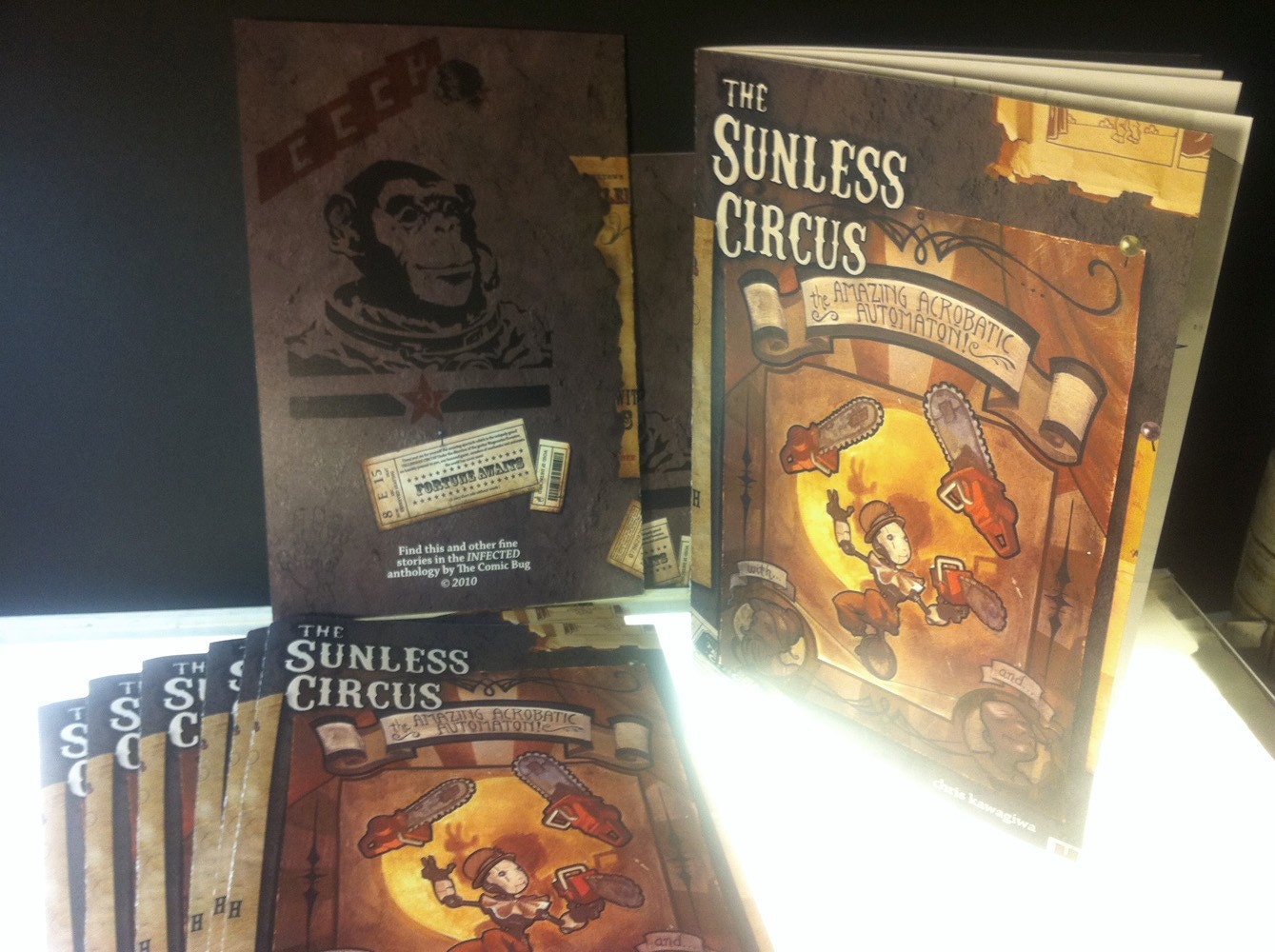
I've been working on a short comic--inspired enough from the Art & Story podcast, finally giving my go at making a short. So far, I'll just say that it involves a robot boy that performs in a circus and the story itself will rely heavily on pantomime (like the first part of "Wall-E").


Also check out exciting developments for independent cartoonists with the UP! Fair going on in November! There's some time maybe to save up for a plane ticket~

I also found this little sketch of a "Mad House"--